All You Need To Know: CMYK vs RGB vs Pantone
by Shawn Toh September 20, 2023

Color plays a pivotal role in the way we perceive and interact with the world. Whether in the vibrant hues of a sunset, the crisp precision of a printed brochure, or the dazzling glow of a website, colors are a universal language.
However, behind this visual symphony lies a complex ecosystem of color models, each designed with a specific purpose.
In this All You Need To Know: CMYK vs RGB vs Pantone, we’ll explore the world of color by explaining these color systems.
1. What is CMYK, Pantone (PMS), and RGB Color?
2. What’s the purpose of Color Systems?
3. Does it matter if you use RGB or CMYK for printing?
4. What is the purpose of Pantone?
5. Setting color mode in Illustrator, Photoshop
6. Conclusion: Know your color mode
As we wrap up this journey through the world of color, we’ll leave you with a clear understanding of when to use CMYK, RGB, or Pantone.
Armed with this knowledge, you can confidently navigate the colorful landscape of design and printing.
Let’s go!
What is CMYK, Pantone (PMS), and RGB Color?
All You Need To Know: CMYK vs RGB vs Pantone
All You Need To Know: CMYK vs RGB vs Pantone
Before we unravel the intricacies of these color systems, it’s crucial to understand what CMYK, Pantone (PMS), and RGB actually are.
In this section, we’ll provide a simple overview of each, highlighting their unique characteristics and purposes.
#1 — Why Different Color Systems?
Color has a big impact on how people see your business. It’s a crucial part of your branding, meaning how you present your company. But here’s the tricky part: colors can look different when you use them in print (like on paper) and on a screen (like a computer or phone).
When you’re designing things, whether for paper or the internet, you want your colors to look the same so that your message is clear, and your brand is strong. But sometimes, this isn’t easy because colors can change from one place to another. Even two different screens can make the same color look different.
So, we’ll break down the color systems and explain the key differences between them.
#2 — RGB Color Model
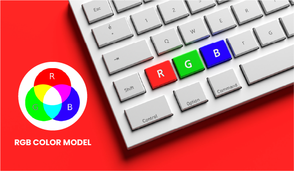
RGB (which stands for Red, Green, and Blue) is the color system for pictures on screens. If you want your design to show up on any kind of screen, you should use the RGB color mode.
Inside a device, there’s a special light that can make any color you want. It does this by mixing red, green, and blue colors and changing how bright each one is. This mixing process is called additive mixing. It starts with everything being dark, like black, and then adds red, green, and blue light to make the colors we see. When you mix red, green, and blue light equally, it makes pure white.
Designers can adjust things like how intense the colors are, how lively they look, and how light or dark they are by changing the red, green, and blue colors. Because this all happens on a screen, designers can control how the light on the screen behaves to create the exact color they want.
#2 — CMYK Color Model
All You Need To Know: CMYK vs RGB vs Pantone
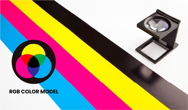
CMYK, which stands for Cyan, Magenta, Yellow, and Key/Black, is the color system used for things like books, brochures, and posters.
When you print something, the printer mixes these four colors using real ink. It’s like a recipe – you use different amounts of each color to make the colors you want. This mixing method is called “subtractive mixing.”
Imagine starting with a white page. When you add the ink layers, they make the page less bright, and that’s how you get the colors you see.
When you mix all of these ink colors together, they create pure black. It’s like mixing all the paint colors together to make black paint.
#3 — The Pantone Color Model
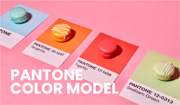
Pantone is a unique color system that doesn’t follow a specific color model. It’s like a big toolbox of colors. Most regular printers use something called the Pantone Matching System to make sure they can recreate colors accurately. Think of it like following a recipe in a cookbook to cook the same dish every time.
Pantone colors are like a rulebook. People use them to make sure their logos and flags have the same colors everywhere. Imagine you have a rule that says a specific red should always look the same, no matter where it’s used.
We’ve compared the colors in our paper collection to Pantone colors. This helps keep the colors consistent when you print things like invitations. You can find these comparisons in the details about our special papers and envelopes.
If you’re using design software on your computer, you can also make your own versions of Pantone colors. It’s like mixing paint to get the exact color you want.
What’s the purpose of Color Systems?
Why do we need distinct color systems?
This section explores the distinct roles of CMYK, Pantone, and RGB in the world of design and printing. Discover why each system is essential for its specific application.
#1 — CMYK For Print
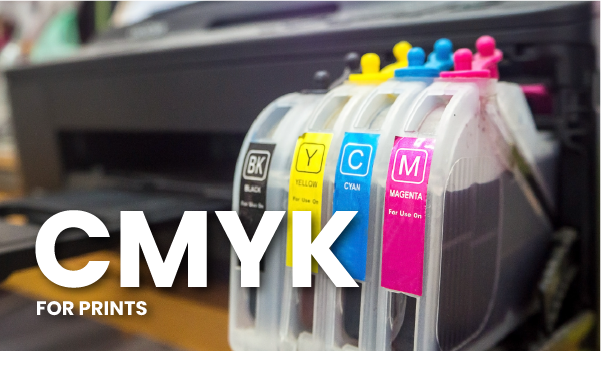
CMYK, which stands for Cyan, Magenta, Yellow, and Black (Key), represents the four colors used in printing. It’s a way to take away colors to make them lighter.
In CMYK, the aim is to soak up the light that bounces off white paper by using ink. When all the colors are put together, they absorb all the light and look black.
CMYK is mainly used for printed things like books and magazines. These days, both home printers and high-quality color laser printers use these four ink colors for printing text and pictures.
It’s important to note that because ink is used instead of light, CMYK colors often look less bright compared to RGB colors.
#2 — Pantone For Color Accuracy
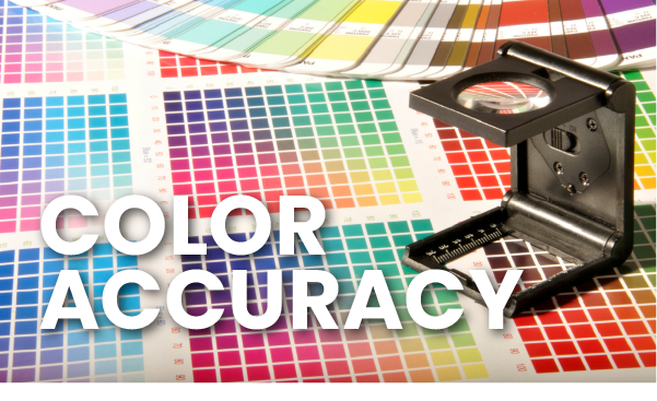
The Pantone Matching System (PMS) completely changed how we print colors. It made things simpler. Most printers now use this system to copy shades and pictures following a set of rules.
These rules make sure that any company can describe a color, and the printer can make it look the same in the printout.
PANTONE is different from CMYK because it doesn’t need a mix of different colors. Instead, PANTONE colors are unique on their own. They are made using thirteen main colors, which can create many different ones. Each unique color gets a number, so there’s no confusion. Right now, there are more than 1,800 Pantone colors.
This numbering system is super accurate, especially for branding. While it might take a bit more time and money, it’s great for simple jobs with 1 or 2 colors (like a business card). It uses less ink than the 4-color model (CMYK).
Pantone is the worldwide standard for talking about colors in printing. It was first made for graphic design but has proven handy in many other industries too.
#3 — RGB For Web & Screen?
The RGB color model is a big deal in digital stuff. It’s all about using numbers from 0 to 255 to make colors on screens. You mix three main colors: Red, Green, and Blue to create all the other colors you see.
Now, CMYK, on the other hand, is a bit different. It’s more like taking colors away to make new ones. Imagine starting with a black screen and then adding Red, Green, and Blue lights to create different colors. When you put them all together, you get White.
Most pictures and graphics you see on the computer use RGB. But here’s the tricky part: each computer screen is a bit unique, so the colors may look a bit different on each one.
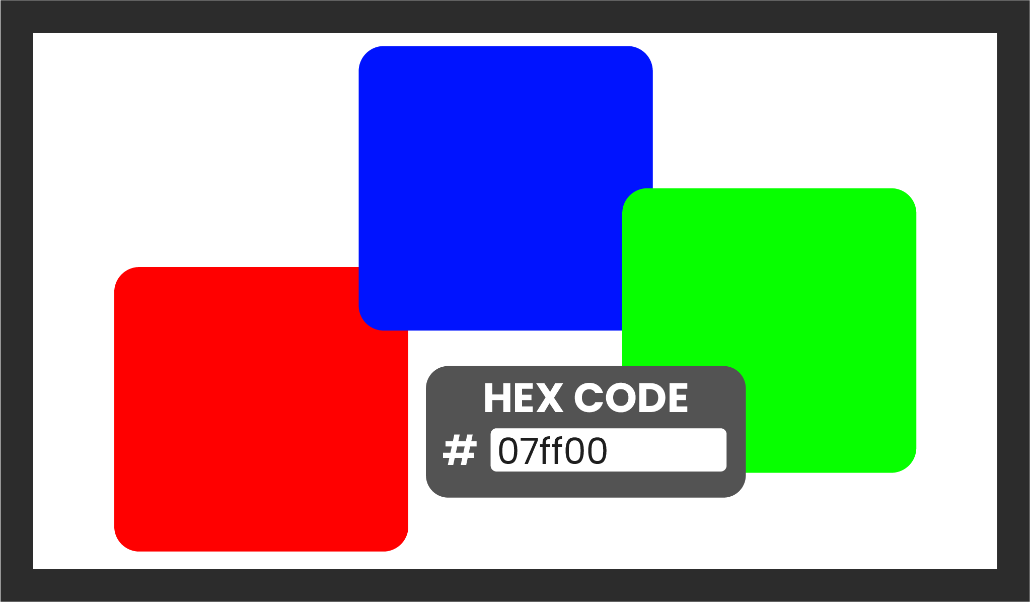
When it comes to using RGB colors in computer code, there’s this thing called HEX code that many folks prefer. It’s a shorter way to work with colors. Instead of those 0-255 numbers, you use a combo of letters (A to F) and numbers (0 to 9), and it’s usually six digits long. Many programs even generate this HEX code for you automatically.
Does it matter if you use RGB or CMYK for printing?
Here, we tackle a common dilemma: using RGB for printing. We’ll address whether it’s possible to achieve precise colors in CMYK and when to opt for RGB.
Additionally, we’ll offer insights into the best file formats for both color modes.
#1 — Is it possible to print an exact color in CMYK
Printing an exact color in CMYK can be a bit tricky. CMYK uses four ink colors – Cyan, Magenta, Yellow, and blacK – to make a wide range of colors. However, it can’t always match every color you see on a screen or in real life.
This happens because CMYK is a “subtractive” system, which means it starts with a white piece of paper and takes away color by adding these four inks. It’s like mixing paints.
Some super bright or vivid colors you see on a computer screen, especially neon-like colors, are tough for CMYK to recreate exactly. Also, there are some colors that are just impossible to make using only these four inks.
So, while CMYK is great for many printing jobs, it might not always give you an exact match, especially for those super fancy or rare colors. That’s why, for precision, things like Pantone colors are often used.
On the other hand, you can take a look at RGB printing made possible here.
#2 — When to use RGB
All You Need To Know: CMYK vs RGB vs Pantone
For projects destined for digital screens like computers, smartphones, tablets, TVs, or cameras, always go with RGB color mode. It’s perfect for:
- Web and app design
- Icons
- Buttons
- Graphics
- Branding
- Online logos
- Online ads
- Social media
- Images for posts
- Profile pictures
- Profile backgrounds
- Visual content
- Video
- Digital graphics
- Infographics
- Photos for websites, social media, or apps.
Choosing RGB for these tasks ensures vibrant, screen-friendly colors.
#3 — The best file formats for RGB
JPEGs work well with RGB files because they find a nice balance between size and quality. Plus, they can be opened on almost any device.
If everyone on your team is using Adobe Photoshop, PSD is the way to go for RGB source files.
When you need transparency, like for buttons, icons, or banners that overlap, PNG is a great choice.
For things that move, like animated logos or bouncing icons, GIF is your best bet.
Don’t bother with TIFF, EPS, PDF, or BMP for RGB. They don’t work with most software, and they can take up too much space.
#4 — When To Use CMYK
Opt for CMYK when making things on paper, like logos, business cards, and ads you see outdoors. This way, your colors will match well with ink and paints. Use CMYK for:
1. Branding: Your company’s look, business cards, and office stuff.
2. Ads: Big signs and posters.
3. Stuff to Sell: T-shirts, hats, and things like pens and mugs.
4. Important Papers: Product packages and restaurant menus.
#5 — The best file formats for CMYK

PDFs work well for CMYK files because they work with most software.
When everyone on the team uses Adobe Illustrator, AI files are the go-to for CMYK.
EPS files can be another good option if people are using different vector programs.
Overall, it’s a good idea to check with your printer to see which file format they like best.
What Is The Purpose Of Pantone?
Pantone, though not as commonly understood as CMYK and RGB, plays a crucial role in maintaining color accuracy.
In this section, we’ll delve into why we need Pantone, exploring its advantages and disadvantages, and even guide you to a handy CMYK to Pantone converter.
#1 — Why do we need Pantone when we already have CMYK
Color Precision
Pantone ensures exact color matches, which can be tricky with CMYK.
Consistency
Pantone maintains the same color across various materials and platforms. CMYK might not.
Special Shades
Pantone offers unique shades that CMYK can’t replicate.
Branding
For branding, Pantone keeps colors consistent, while CMYK might vary.
Printers’ Choice
Some printers prefer Pantone for better results.
Specific Needs
For specific projects, like logos or branding, Pantone is a better choice.
In a nutshell, Pantone complements CMYK by providing precise, consistent, and unique colors that are crucial for various design and branding needs.
#2 — What are the pros and cons of using the Pantone system?
Pros of Using the Pantone System:
Color Consistency
Pantone ensures the exact same color every time, which is vital for brands that want their logo or design to look identical in every application.
Customization
Pantone offers a wide range of colors, and you can even create custom shades, allowing for unique and precise color choices.
Accurate Printing
When it’s crucial to get colors spot-on in printed materials, Pantone delivers accurate results that CMYK can’t always match.
Cons of Using the Pantone System:
Limited for Digital Use
Pantone is primarily for print, so it’s not the best choice for digital projects like websites and social media graphics.
Cost
Using Pantone colors can be more expensive due to the need for special inks and extra printing processes.
Complexity
The Pantone system can be intricate to work with, and not all designers are familiar with it, which might lead to misunderstandings or errors.
In a nutshell, Pantone offers precision and customization for print, but it may not be suitable or cost-effective for all design applications.
#3 — CYMK To Pantone Convertor
For a hassle-free conversion of your CMYK colors to Pantone, simply click here to access the converter website
Setting color mode in Illustrator, Photoshop
All You Need To Know: CMYK vs RGB vs Pantone
#1 — Color Settings for Photoshop
When you start a new project in Photoshop, you’ll see the Color Mode choice alongside other settings in the New Document window
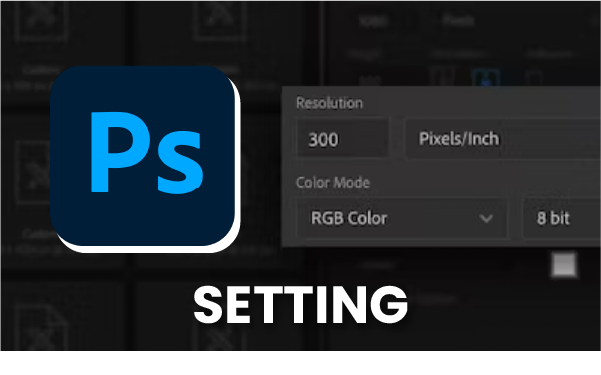
The Photoshop Color Mode setting can be found in the New Document window.
#2 — Color Settings for Illustrator
In Illustrator, when you start a new project, you might not immediately see the Color Mode choice. To find it, click the arrow to open the hidden menu called Advanced Options.
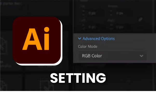
The Illustrator color mode is found tucked away in the fancy settings of the New Document window.
Know Your Color Mode
All You Need To Know: CMYK vs RGB vs Pantone
As we wrap up this journey through the world of color, we’ll leave you with a clear understanding of when to use CMYK, RGB, or Pantone.
Armed with this knowledge, you can confidently navigate the colorful landscape of design and printing.
You can also contact us via the chatbot or simply drop us a DM on our Instagram page if you’d like to know more about our courses
. . . . .
