Design Tips For Non-Designers
by Wei Ying January 12, 2022
“Well, I’m not a designer…”
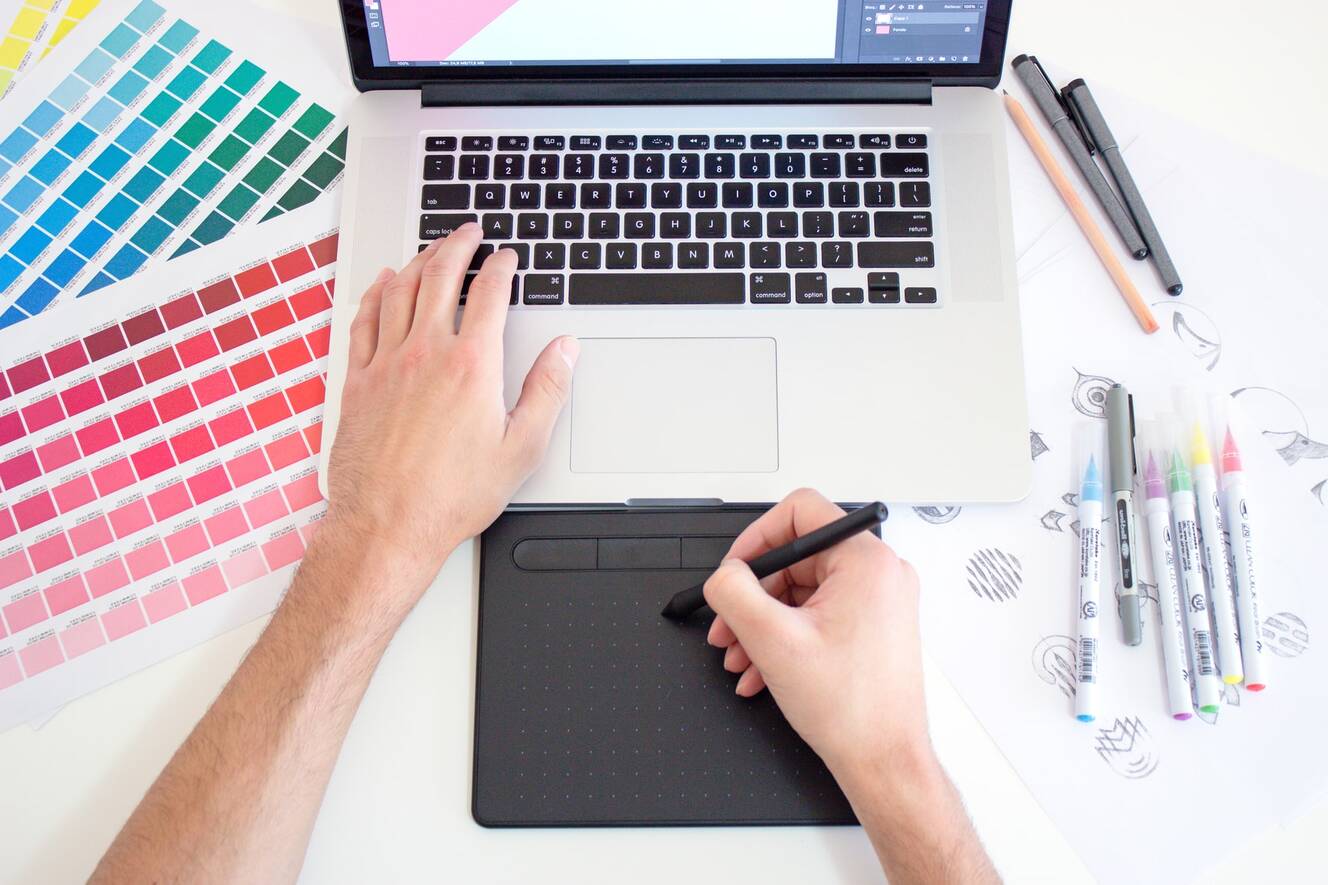
Aching to churn out non-disastrous designs but do not possess a certification from LASALLE College of the Arts? The good news is that you still can! May these design tips for non-designers like yourself be your holy grail.
Unfortunately, it is not uncommon for companies to seek employees who can cover a wide scope of roles these days.
So, if you are in creative departments, such as marketing, the likelihood of you creating basic content is quite high. However, do not despair just yet. Fortunately, your designs need not possess the standards of LASALLE graduates.
Your designs simply need to look — put together. Here’s how,
#1: Just one font design, but if you must, two
Less is really more. The last thing you want is for your copy to look like a hot mess. As a designer or graphic artist, to create appealing, eye-catching, and effective graphic design, do pick easy-to-read font designs.
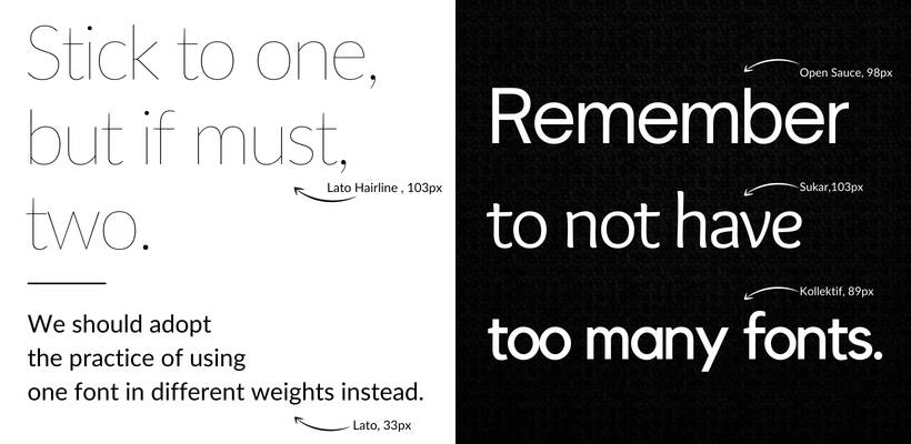
Tip #1: Use fonts sparingly
When designers use multiple font designs for one asset, trust me, a whole lot of considerations have been carefully taken into. For a start as beginners like you and me, we should adopt the practice of using one font design in different weights instead.
#2: Let the fonts do the talking!
Just as they say that pictures speak a thousand words, do not underestimate the power of these tiny curvatures or sharp-edged letters. They too have a story to tell, or in this case, a mood to convey.

Tip #2: Font type matters to your readers
Font designs with rounded edges, like Calibri connote a sense of warmth and friendliness; Hard-edged fonts, like Sans Serif convey strength; Serifs, fonts with decorative strokes at the end of the stem of letters, such as Georgia, give off an air of sophistication.
You can even take it a step further and consider the typography design of your asset. Here, you are not just looking at font type and size, but also the arrangement, the spacing and the length of copy of a line and page. What you want, is to make your content attractive and easy-to-read.
Thus, pick wisely.
If you would like to learn more about arranging texts and graphic elements all together, you may check out our Infographic Workshop.
#3: Embrace the power of scale
Big or small, you should take note of the sizing of elements based on your arrangements. Naturally, you would draw a baby to be much smaller than his parents. Thus, scales serve as a gauge for us.
However, scales need not always reflect real life! Unleash your inner drama queen and exaggerate the size of certain elements of your design to highlight their importance.

Take note of the scale of characters in Dune’s movie poster
Check out the poster of “Dune” above. Of course, we all know that the face sizes of human beings are roughly the same.
Despite this fact, the dramatic increase in the size of Timothée Chalamet’s face tells the audience immediately that he is the main lead. Just like that, his importance in the movie had been emphasised. While conveying that the rest of the characters featured on the same poster take the back seats.
#4: Negative Space
These days, all thanks to COVID-19, we are all for being negative, aren’t we? In all seriousness, similarly in design and graphic design, negative in terms of tapping into negative space, is a good thing!
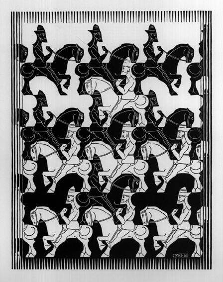
M.C. Escher’s tessellation work using “Negative & Positive Space”
Negative space is basically the space in between the area of other surrounding elements that make up its own shape. In layman’s terms, what we would regard as the background.
On the other hand, positive space refers to the main subject or shape of the asset.
#5: Own your best colour combinations!
This is not the time for you to go crazy and hit all the colours of the rainbow!
Instead, pick a strong colour palette for your brand and stick to it religiously. Colours are incredibly essential to designs because they are capable of invoking certain emotions and moods. After all, each shade has its own symbolism, which I am sure you would have heard. Red conveys dominance; Purple for luxury. Ring a bell?
However, it certainly does not mean that you have to always incorporate colours!
Let’s take a look at Tech Giant — Apple,
If anything, one might even say that the brand’s colour palette is rather dull, with whites, greys, and black forming the bulk of the colour scheme for its collaterals.
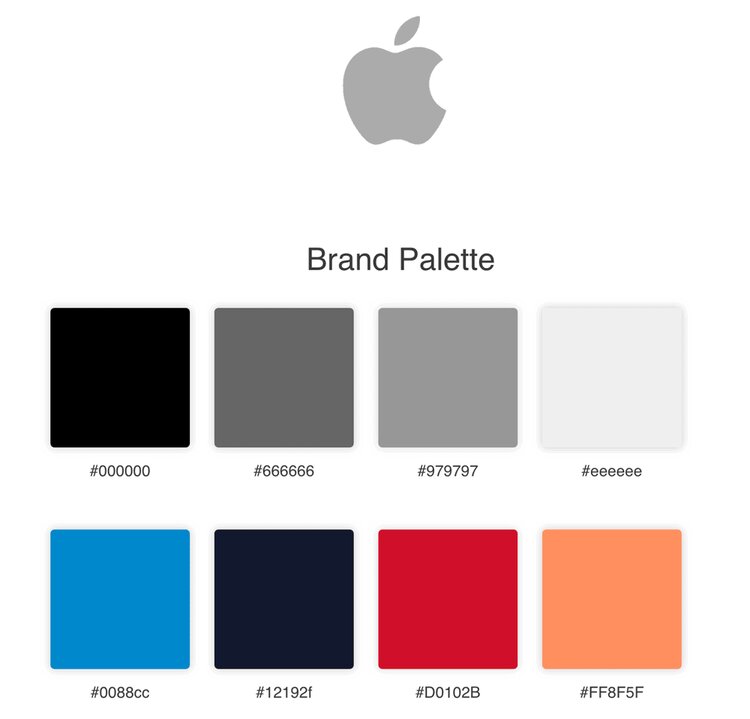
Apple has a standardised colour palette that the brand uses to associate with its identity
So, why! Firstly, a lack of colours allows Apple to craft their own story freely without being bound by specific connotations that colours possess.
Secondly, we all have our own interpretations of the colours black and white. Hence, Apple is encouraging users to write their own stories, which is honestly pretty smart.
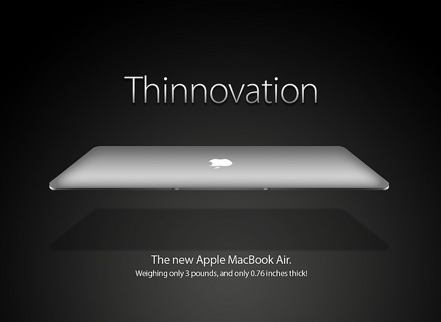
An ad for Apple’s Macbook Air campaign
Furthermore, with a muted colour palette, more attention could be diverted to their products. This emphasises the fact that they are all about the hard facts, are data-driven and their products are of quality. In essence, they mean what they sell.
Besides its primary colour scheme, Apple certainly does not shy away from splashes of colours too. Complementary colours are injected into their advertising assets for product launches.
Ultimately, what you should be looking out for is consistency within a strong colour palette!
Indeed, you might not be winning design awards just yet, but hopefully, these tips serve as a springboard for your design journey. If you ever need more practice to hone your skills, check out our Adobe Design Masterclass!
Contrary to popular belief, churning out good designs is not easy. Here is a piece of advice to all the budding designers out there —
patience, hard work, and practice.
. . . . .
